Bitmap Monogram

Prior to the development of modern vector typefaces, digital imagery and typography relied on bitmap construction. This project explores that foundational approach by utilizing a strict grid system composed solely of vertical and horizontal units. The design draws inspiration from the bold, structural qualities from both Gothic-style and Slab serif typefaces, reinterpreted through a contemporary lens.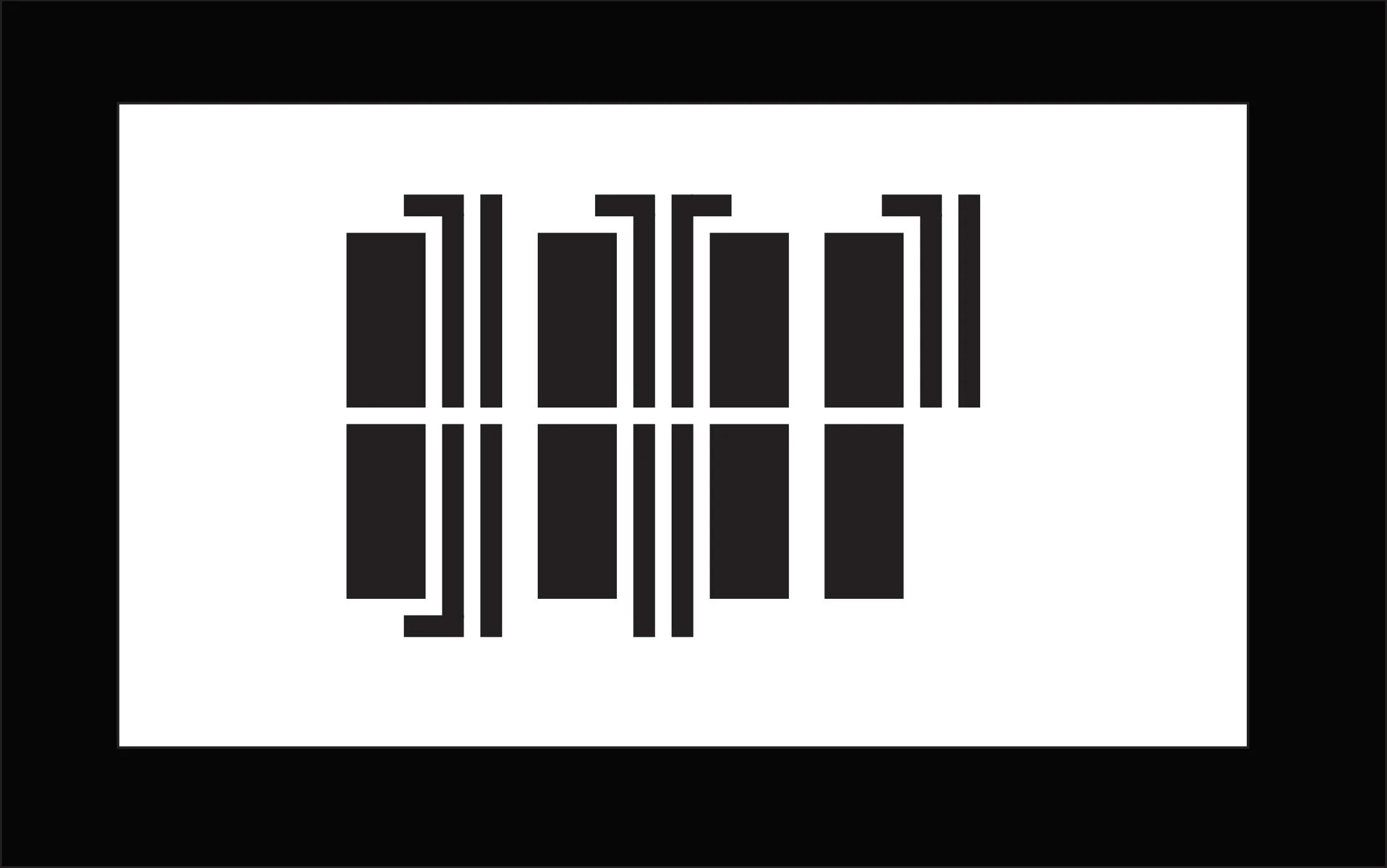
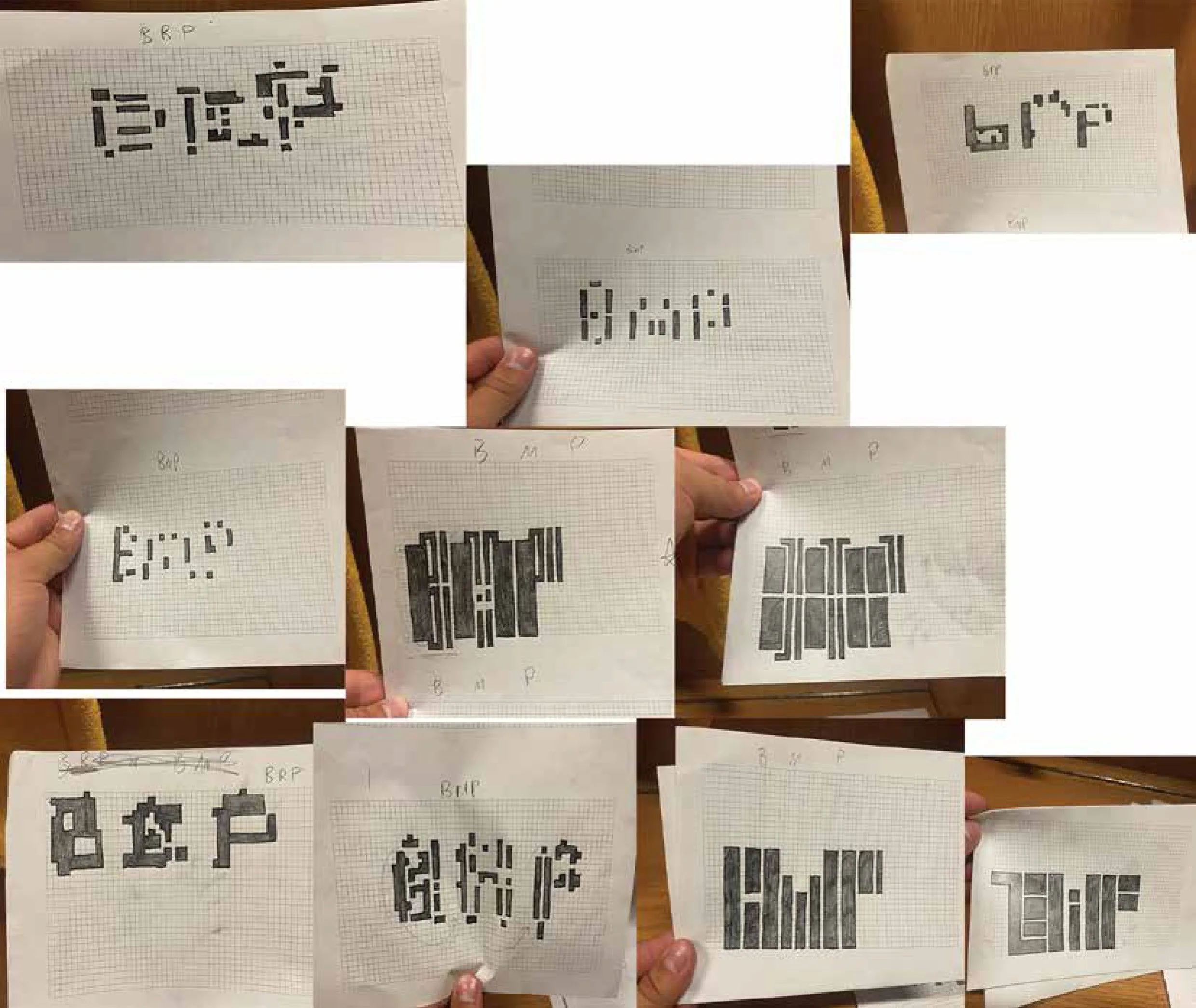
Process work
Original
revised
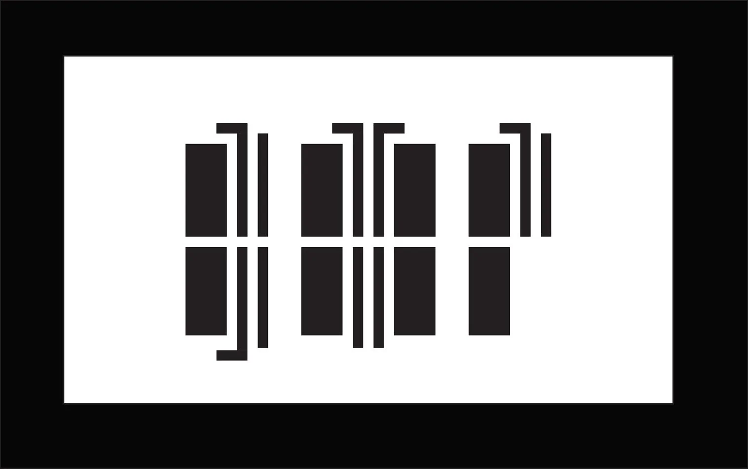
Letterforms were refined by increasing spacing for improved legibility. Adjustments to the B and P included shortening the front strokes to enhance their rounded shapes, while the M was modified by reducing the length of its bottom lines for better balance.