typographic manipulation poster: rise lantern festival

Inspired by the annual RiSE Lantern Festival near Las Vegas, where thousands release personalized lanterns into the night sky as symbols of hope, reflection, and unity. This poster design reimagines the event through the lens of a vintage postcard. Careful typographic manipulation and thoughtfully selected typefaces were used to evoke nostalgia, while a warm palette of soft oranges, yellows, and reds reflects the glow of the lanterns and the atmosphere of the festival.
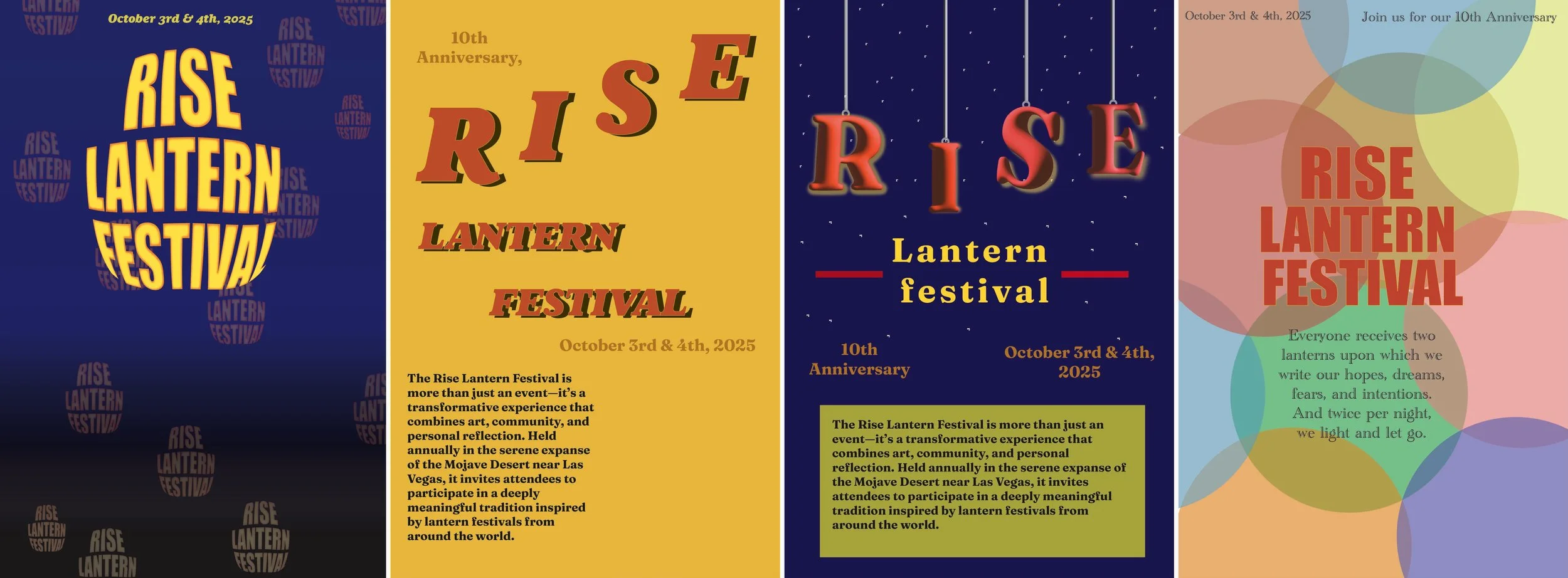
original
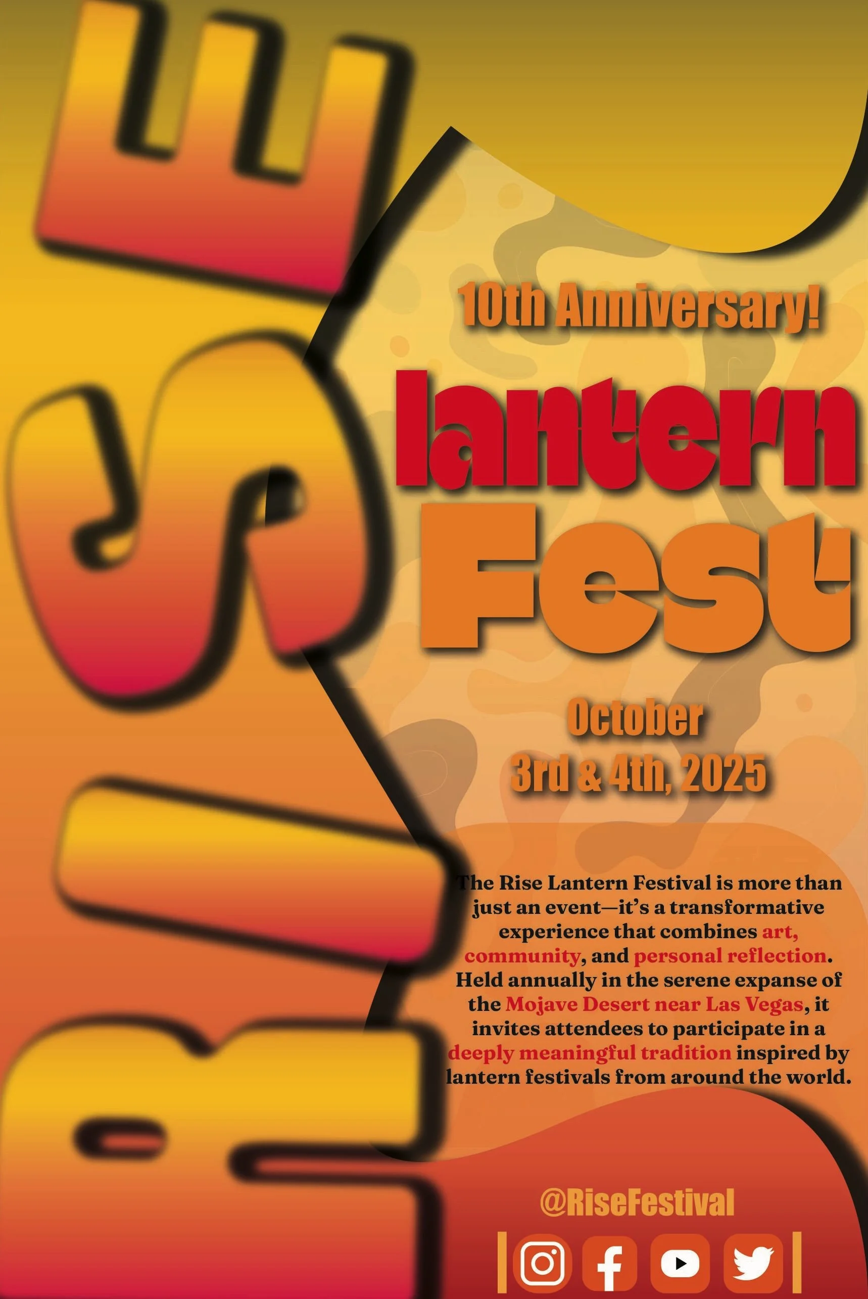
The final poster evolved significantly from the original concept, with major changes to both layout and content. Initially, the design focused on typographic movement, using the word “RiSE” ascending the page to mimic the upward motion of floating lanterns. However, the direction shifted entirely in the final version, opting instead for a vintage postcard aesthetic. This new approach maintained the warm color palette of soft oranges, reds, and yellows to preserve the visual connection to the lanterns and the ambiance of the festival.

mockups

process work
revised